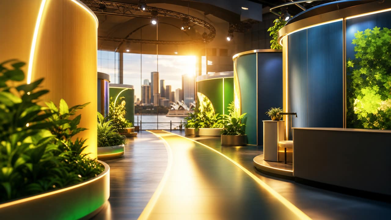



Many Australian exhibitors underestimate how much stand colour choices influence visibility, engagement and perceived credibility. Within seconds, visitors decide whether to stop or keep walking, and colour does much of that heavy lifting. When brands treat Exhibition Stand Design as a last-minute artwork task instead of a strategic discipline, they risk disappearing into the visual noise of a major trade show.
Colour that feels fine on a logo or website can become overpowering, dull or distorted once it’s scaled up across walls, flooring and signage. Overly bright schemes may feel aggressive under hall lighting, while muted palettes can fade into neighbouring stands. Misjudged colour also undermines legibility, making headlines, product benefits and calls to action harder to read from the aisle.
Trade shows in Sydney, Melbourne and Brisbane are crowded, high-stimulus environments where visitors process information at speed. Stands that lack a clear focal point, coherent palette or strong contrast simply blur into the background. Without deliberate visual hierarchy in stand graphics, even strong offers struggle to cut through, and marketing budgets quietly leak away as delegates drift to more visually confident competitors.
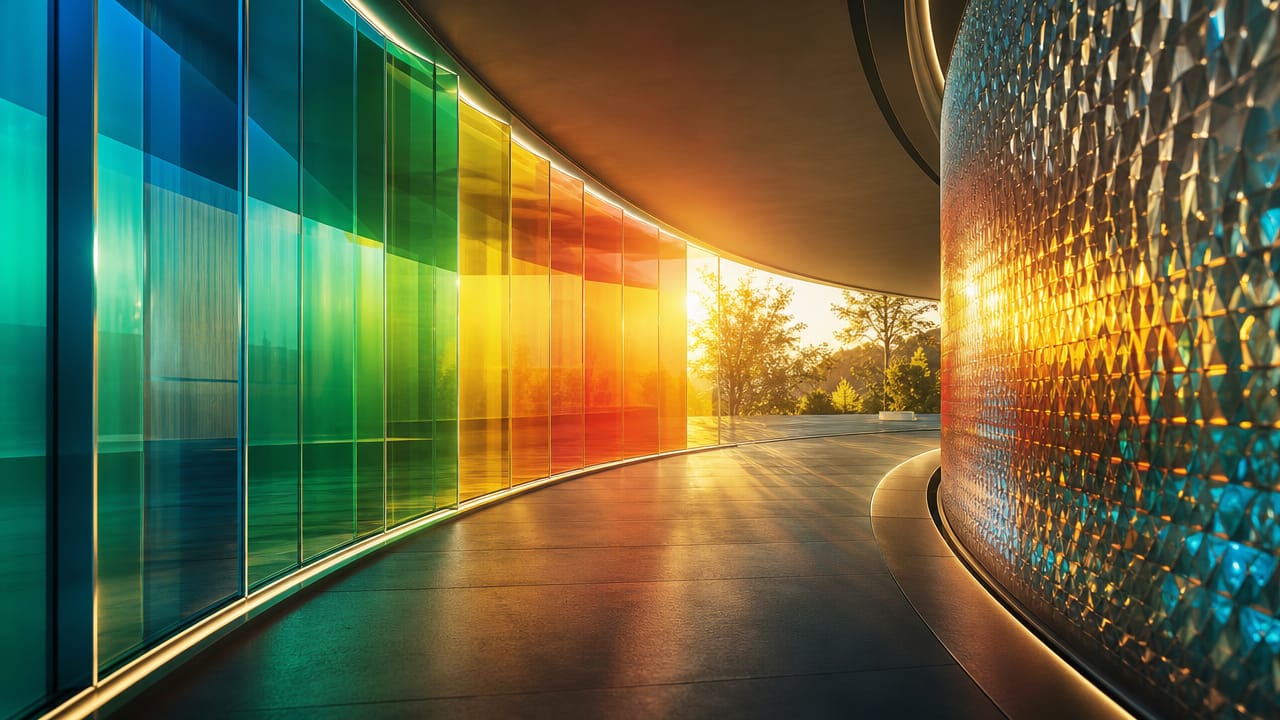
A frequent issue is lifting the corporate style guide into a booth without testing how it works at three or four metres high. Australian exhibition colour trends show that heavy reds, yellows and neons can quickly fatigue visitors when used wall-to-wall. At the other extreme, conservative blues and greys may look safe in print but read as lifeless on the show floor, particularly when paired with flat, uniform lighting.
Warning signs often appear on day one: foot traffic skirts the carpet edge, product zones sit empty and staff end up doing all the work of pulling people in. Photos may look flat on LinkedIn despite careful exhibition booth design, and social posts fail to convey the energy of the stand. Teams sometimes blame the event or audience, when the real issue is a colour story that doesn’t align with the brand, offer or environment.
There is also a subtler risk when brand-led booth colour schemes send the wrong emotional signal. Finance or healthcare companies using aggressive, promotional reds can feel untrustworthy, while playful pastels may undersell high-tech innovation. More considered exhibition stand ideas use colour blocking for display walls to separate demos, meetings and lead capture, while high impact trade show colours are reserved for hero messages instead of every panel.
For marketers investing in custom exhibition stands, the stakes are high: floor space, freight, travel and staffing quickly add up. A misjudged palette quietly erodes return on investment, even when the product and sales team perform well. Before rebooking space, it’s worth reviewing event photography, assessing visual hierarchy issues and exploring australian exhibition colour trends with a specialist who understands how visitors actually move through a stand.
If your last event felt strangely quiet despite solid promotion, it may be time to interrogate how your colour choices are shaping first impressions. Consider gathering candid feedback from your team, analysing where visitors hesitated or walked past, and speaking with an expert in stand colour strategy. A short consultation can help you recalibrate your approach so your next show presence works harder, attracts the right audience and converts more of the traffic you are already paying to reach.
Ready to stress-test your current approach before locking in another show? Review your most recent stand photos, note where attention naturally falls, and discuss your findings with an exhibition specialist who can align colour, layout and messaging. A focused review now can prevent another underperforming show and ensure your next appearance stands out for the right reasons.
Input your search keywords and press Enter.