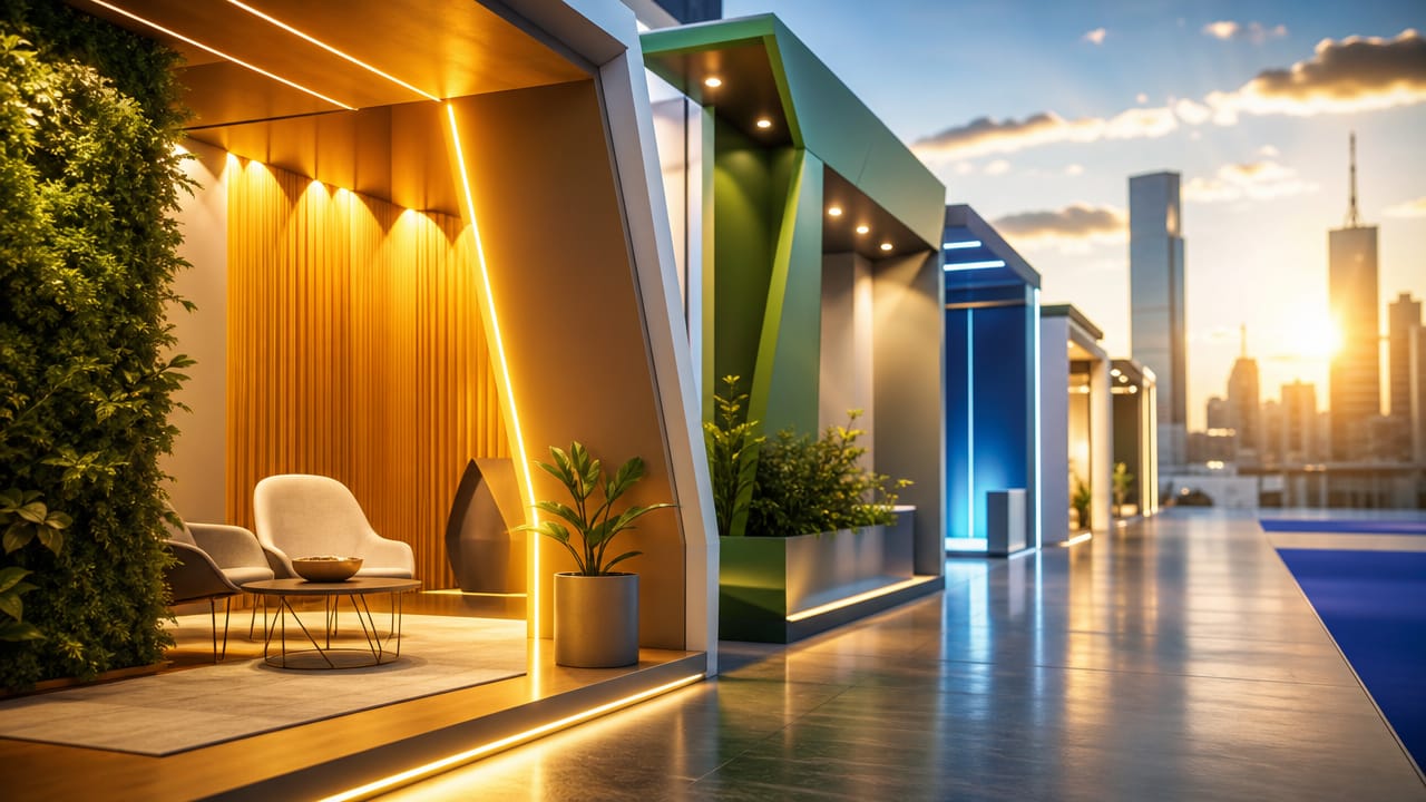



The Role of Colour in Stand Design: Evoking Emotions is increasingly central to how Australian brands cut through noisy trade show environments and convert passing interest into genuine leads. In crowded expo halls, visitors make snap decisions within seconds, and colour plays a decisive role in whether they pause, approach and remember your presence. When used strategically, it can both express your brand and guide behaviour on the floor.
Consistent brand colours in stand design help visitors recognise you quickly from across the hall and trust what they see. Applying your palette across graphics, flooring and product zones avoids the “patchwork” feel that weakens brand recall. Australian marketers are increasingly using brand colours in stand design to connect campaigns, websites and physical activations into one coherent experience. This discipline also makes it easier to brief agencies and align multiple suppliers.
Careful use of colour psychology in exhibition stands lets you engineer how people feel the moment they step onto your space. Warm reds and oranges can fuel urgency around timed offers, while blues and teals calm decision-makers comparing complex solutions. Greens and earthy tones support sustainability narratives that resonate strongly in Australia’s climate-conscious market. Teams who plan colour palettes for custom stands alongside messaging tend to see stronger dwell times and more qualified conversations.
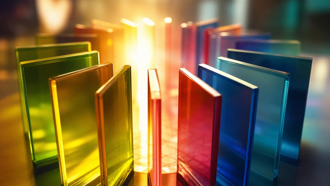
Smart contrast turns your stand into a clear story rather than visual noise. High contrast between backgrounds and typography makes calls to action, demo times and sign-up prompts impossible to miss. Exhibitors increasingly use using accent colours on displays to highlight hero products, interactive touchscreens or sampling points. This improves the visual impact of stand colours in photos and video, extending the life of your investment across social and sales follow-up.
Warm and cool stand lighting can completely shift how the same hues are perceived, from boutique hospitality to cutting-edge tech lab. Combining backlit panels, spotlights and softer ambient light lets you differentiate zones and control mood. Texture matters too: gloss finishes amplify colour energy, while matte surfaces feel more premium and understated. When these elements are planned alongside exhibition booth design, you gain more control over both emotion and flow.
Colour zoning in exhibition layouts helps separate quick “browse” areas from deeper consultation spaces, matching different visitor intentions. For B2B trade days, many teams favour calmer schemes that support serious conversations, then dial up saturation for consumer-facing weekends. Modular graphics and custom exhibition stands make it easier to adapt without rebuilding from scratch. If you want emotion-driven exhibition booth design that aligns with Australian buyer expectations, expert support in Exhibition Stand Design can turn good exhibition stand ideas into a high-performing lead machine.
If you’re planning your next Australian show and want colour to work harder for your pipeline, now is the time to act. Speak with our stand specialists to refine your colour strategy, translate it into a high-impact physical space, and design a booth that attracts, engages and converts. Enquire today to book a consultation and start planning a stand that turns every interaction into a measurable sales opportunity.
Input your search keywords and press Enter.