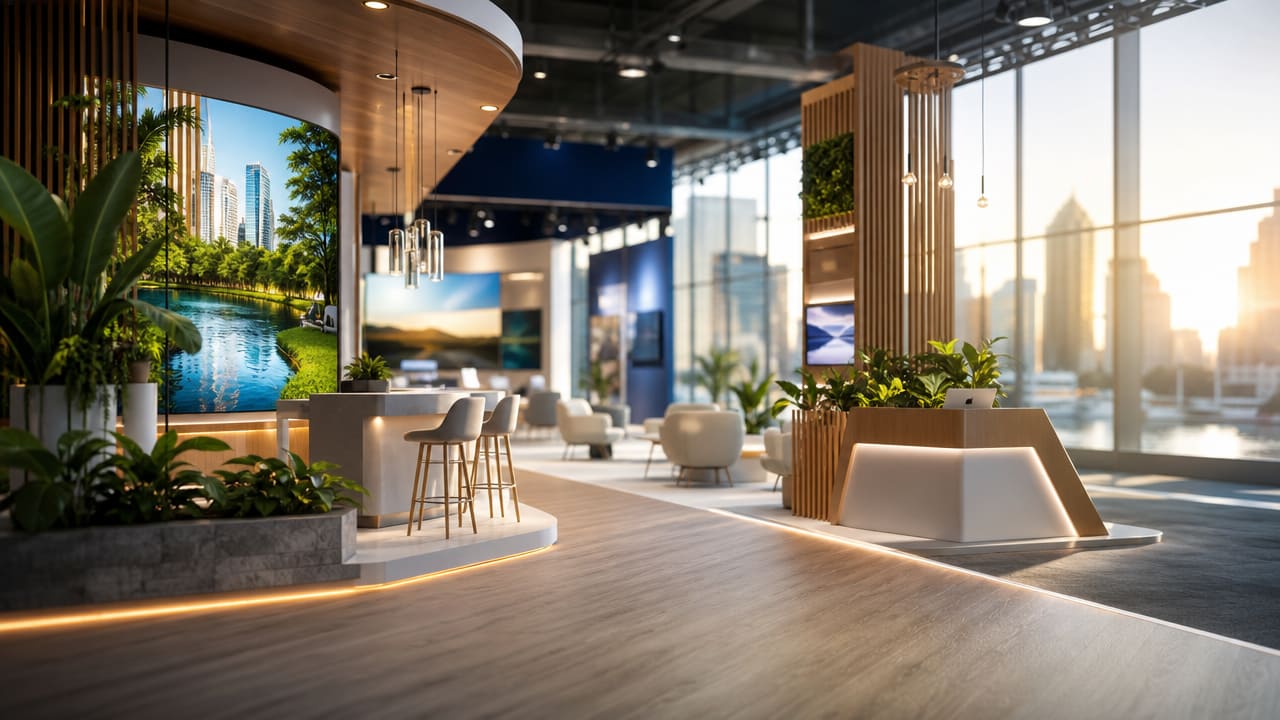



The hidden cost of getting your Exhibition Stand Design wrong rarely shows up on the invoice. It appears later as empty floor space, rushed conversations, and a disappointing lead list after a major Australian trade show. When aesthetics overpower functionality, or practical needs smother visual impact, businesses quietly lose opportunities they have paid thousands of dollars to access.
Large events such as the Australasian Gaming Expo and Fine Food Australia attract thousands of qualified buyers, yet many exhibitors capture only a sliver of that potential. A stand that photographs well but confuses visitors, blocks circulation, or hides staff sends people back into the aisle. On the flip side, a purely practical layout with plain panels and weak branding struggles to cut through visual noise and competing exhibition booth design concepts nearby.
Early warning signs are often subtle. Visitors slow down, glance at the stand, then move on without crossing the boundary carpet. Staff find themselves stepping into the aisle to intercept passers-by because the entry point feels closed or awkward. Products are jammed into corners, forcing would-be customers to bend, reach, or queue. These issues can occur even with expensive custom exhibition stands when no one has mapped a clear visitor journey.
Imbalance often creeps in under tight timelines, when teams reuse old structures or chase fresh exhibition stand ideas without testing them against real visitor behaviour. Brand teams may prioritise high impact booth graphics and dramatic branded exhibition backwalls, while sales teams push for more product and extra meeting space. Without shared planning, zones start competing, circulation paths vanish, and critical sightlines are blocked.
When these patterns appear, the problem is rarely just “poor salesmanship”. It usually signals a lack of functional exhibition stand design thinking: unclear zoning, no allowance for peak traffic, or open plan trade show stands that look inviting but leave staff with nowhere to hold focused discussions.
Over time, Australian exhibitors may conclude that “trade shows don’t work”, when the real issue is misaligned australian exhibition stand styles and rushed planning. A more strategic approach to trade show stand layout tips, including thoughtful lighting, storage and circulation, can rescue the investment. Reviewing your last build, debriefing staff, and critically assessing your current Exhibition Stand Design is a practical first step before your next event locks in. If the same issues keep surfacing, it may be time to speak with a specialist for grounded guidance instead of repeating costly mistakes.
Before you commit to your next build, take an honest look at how your stand balances form and function. Ask your team where conversations were cut short, which areas stayed empty, and what confused visitors. Then consider booking a professional review to align layout, messaging and operations so your stand works harder at every show.
Input your search keywords and press Enter.