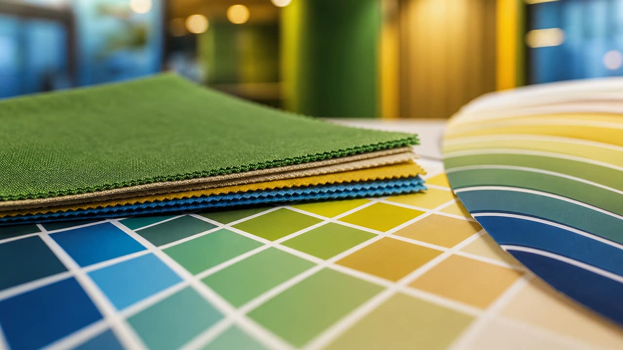



In crowded Australian exhibition halls, how to use color psychology in your shell scheme design is fast becoming a serious competitive advantage. Exhibitors are realising that smart palettes can slow foot traffic, cue emotion and make compact shell scheme displays work far harder. Instead of defaulting to plain white panels, brands are using targeted colour choices to signal credibility, innovation, value or calm within seconds.
Colour influences how visitors perceive your brand before a staff member says a word. Reds and oranges create urgency and excitement, ideal for show specials, competitions or fast demonstrations. Blues and teals communicate trust, competence and stability, making them popular for finance, government and tech. Greens connect naturally with sustainability and wellbeing narratives, while neutrals support premium positioning if paired with precise lighting and strong shell scheme graphics.

Effective colour psychology for shell schemes starts with your existing brand palette, then adapts it to the realities of aluminium frames, panel joins and venue lighting. Many exhibitors nominate a darker back-wall base colour, then use one or two bright accents for headlines, product zones and key calls to action. For a compact shell scheme booth, high contrast such as navy with white or charcoal with lime enhances long-range readability and helps staff quickly direct visitors.
Behaviour should shape your palette as much as branding guidelines. If you need visitors to pause for demos or in-depth conversations, cooler blues and greens with soft lighting support longer dwell times. Short, high-energy interactions suit bolder reds, corals and yellows used sparingly on hero offers and directional signage. High-impact shell scheme color ideas often combine a calm, neutral base with one vivid accent repeated in furniture, literature holders and shell scheme graphics.
Before committing, assess how colours behave under Australian venue lighting, which can vary from harsh LEDs to warm halogens. Request printed proofs and view them in similar conditions to your target show, checking legibility for all age groups. Shell Scheme Stands, especially first-time builds, benefit from expert input on contrast ratios, especially when integrating shell scheme displays with digital screens and illuminated logos. Finally, think about social media: using color in shell scheme booths that photograph well can extend your exposure far beyond the aisle.
Exhibitors comparing solutions can work with designers, hire companies or print specialists to balance ambition with budget, especially when custom elements are layered onto a standard shell scheme booth. A specialist can recommend when to invest in premium finishes and when to rely on clever colour blocking instead. Ready to refine your approach? Talk to an exhibition expert about tailored colour plans that make your next stand work harder, from layout choices to print-ready artwork.
Input your search keywords and press Enter.