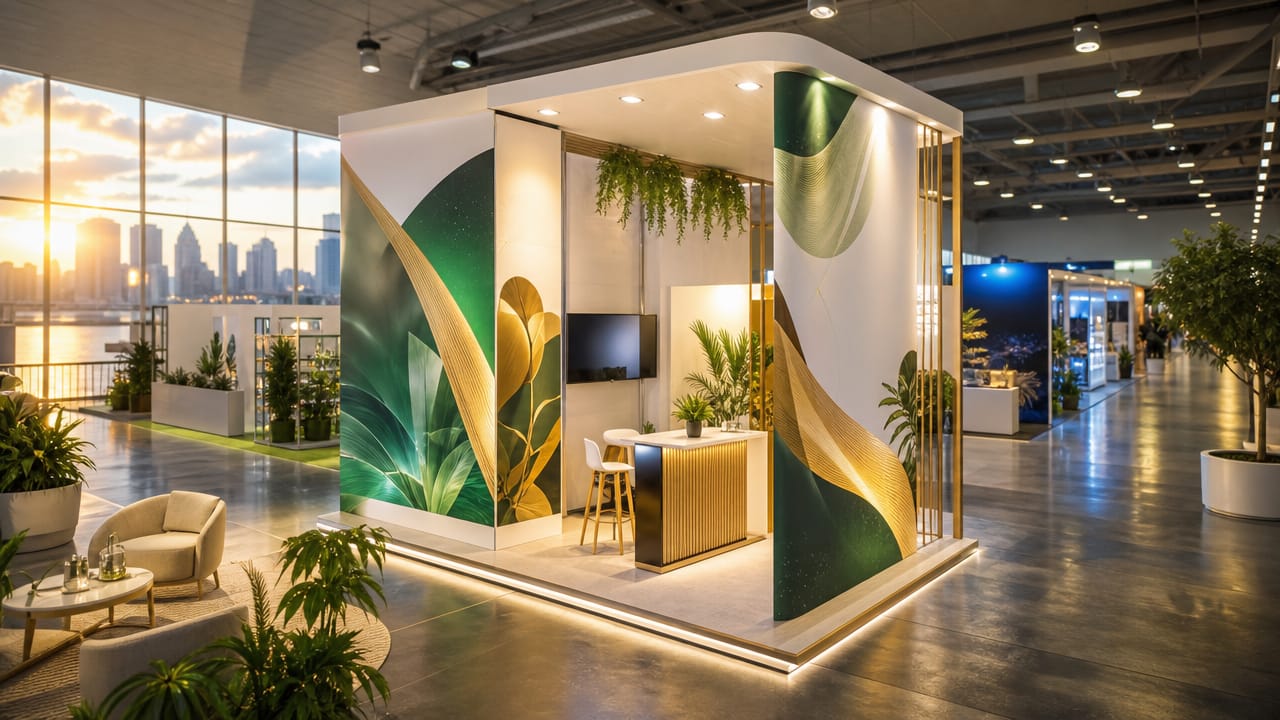



Many Australian exhibitors underestimate how much poorly planned shell scheme graphics can undermine their visibility at trade shows. In a crowded hall, strategically placing graphics in your shell scheme is key to attracting attention and communicating your message effectively, yet this is often treated as an afterthought. The result is wasted spend on materials that attendees barely notice, or confusing layouts that dilute core messages. Recognising these placement problems early can prevent your brand from disappearing into the background.
One of the biggest issues with shell scheme graphics is failing to match the content to the physical space. Exhibitors frequently order panels without accurately measuring the booth, leading to cropped logos, awkward gaps or important information hidden behind furniture. Misjudged sizing is especially common with shell scheme displays that are ordered in a rush. When this happens, staff end up improvising onsite, taping pieces together and creating an unprofessional first impression.
Another recurring problem is ignoring eye level and natural sightlines. Key messages are often placed too low, too high or scattered across panels, forcing visitors to work to understand what you do. A well-planned shell scheme booth should present its main benefit in the central viewing zone, visible within a few seconds as people walk past. When graphics are split randomly between the back wall and side panels, passers-by leave without a clear reason to stop.

Even strong artwork can fail when lighting and visitor flow are ignored. Exhibitors routinely rely on venue lighting, leaving important shell scheme wall graphics in shadow while less important areas are brightly lit. Others clutter the floor with counters and literature stands that block sightlines to cost-effective shell scheme backdrops. In compact spaces, small shell scheme booth ideas that consider traffic flow and focal points are essential to stop your stand feeling cramped or visually noisy.
The push to save money can also create hidden risks. Relying solely on portable displays for shell schemes or last-minute pull-up banners may seem economical but often fragments your story. Without a cohesive plan, attempts to upgrade a basic shell scheme become a patchwork of styles and sizes that confuse attendees. Similarly, focusing more on giveaways than layout means the back wall, side panels and shell scheme graphics never work together to guide conversations and capture qualified leads.
These issues matter because trade show windows are short and competitive. When Shell Scheme Stands fail to communicate clearly, teams rely on staff to explain everything verbally, reducing efficiency and missing casual foot traffic. Exhibitors who step back and review how their shell scheme booth appears from different angles can quickly spot weak messaging, poor hierarchy and underused surfaces. If you suspect your current approach is underperforming, now is the time to reassess your placement strategy and consider expert guidance before your next event.
Input your search keywords and press Enter.