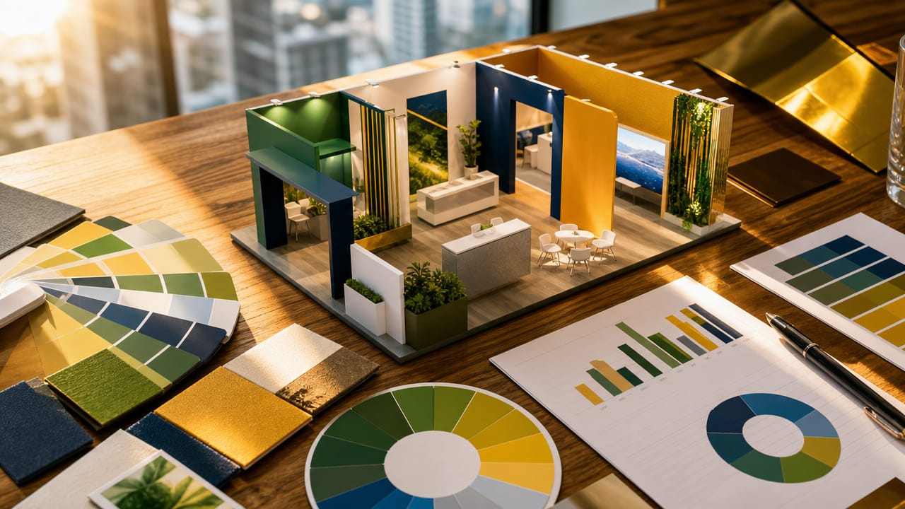



Colour Psychology: Choosing the Right Palette for Stands is becoming a critical topic for Australian exhibitors who feel their trade show presence looks polished but somehow underperforms. In busy convention centres from Sydney to Perth, visitors often decide whether to stop in a matter of seconds, and much of that snap judgement is driven by colour. When the palette is off, even the most expensive build struggles to deliver a return on investment.
Many brands still treat colour as an afterthought in Exhibition Stand Design, relying on guesswork or personal preference rather than strategy. Research consistently shows that people form rapid impressions based largely on colour, meaning your palette can quietly undermine trust, clarity and recall. In practical terms, this can mean fewer conversations, weaker leads and a stand that fades into the background of a crowded expo hall.
One early red flag is strong foot traffic flowing past your space, but only a trickle of visitors actually stepping in. Another is people repeatedly asking what your company does, despite clear copy and logos. This suggests the visual impact of stand colours is sending mixed signals. Harsh contrasts, heavy reds or clashing tones can create fatigue, while overly bland trade show stand colour schemes disappear under harsh venue lighting.
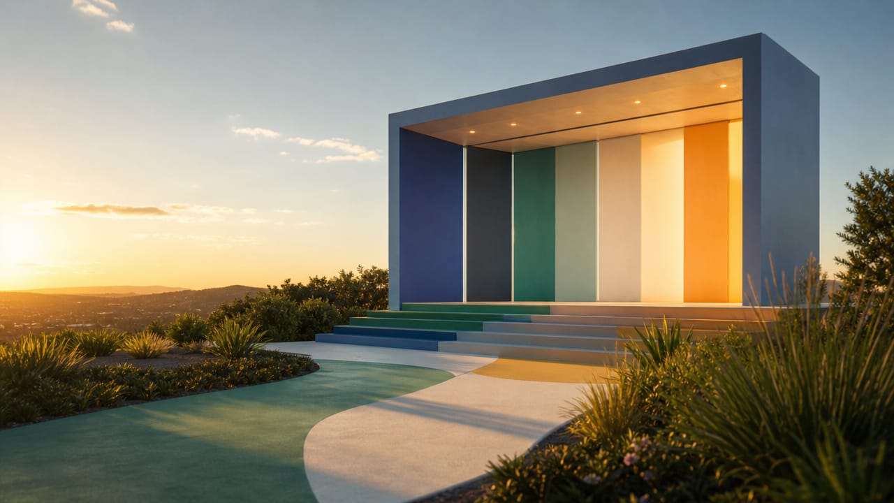
When stand colours clash with your positioning, visitors may feel something is “off” without knowing why. A fintech brand using playful pastels might struggle to convey stability, while a sustainability exhibitor wrapped in glossy black and neon could appear inauthentic. Misjudged emotion-driven stand colour choices can also skew expectations, attracting the wrong audience or making serious offers look gimmicky.
These issues often stem from skipping a structured review of colour psychology for exhibition stands during planning. Teams might over-prioritise novelty exhibition stand ideas, or copy competitors instead of reflecting their own audience and message. Over multiple shows, custom exhibition stands that keep shifting palette waste budget and dilute brand memory. Even strong colour-led exhibition stand ideas can underperform without clear objectives behind every hue.
Australian marketers who want to avoid these hidden risks should start treating colour as a measurable lever, not decoration. That means testing trade show stand colour schemes under realistic lighting, aligning them with audience expectations and documenting rules for future builds. If your current space feels busy yet strangely forgettable, it may be time to reassess your colour themes for custom stands with expert support. Consider speaking with a specialist to audit your next design and ensure your stand palette works as hard as the rest of your campaign.
Input your search keywords and press Enter.