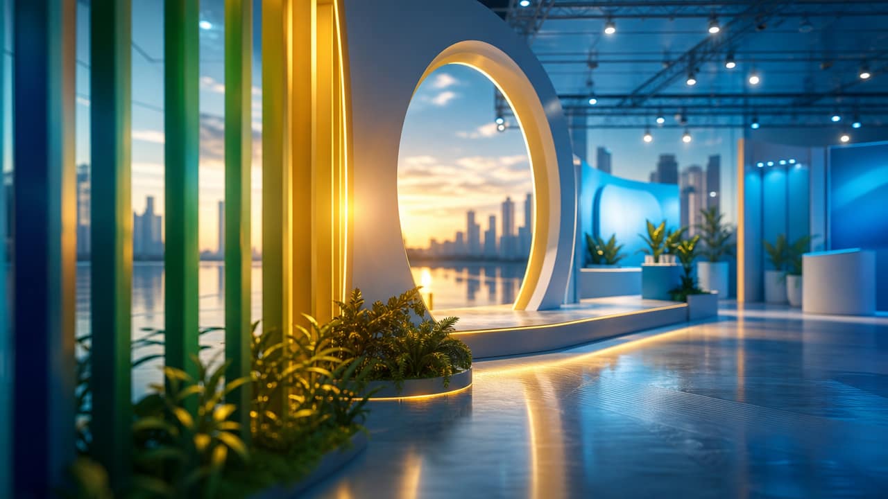



Colour is more than decoration; it is a competitive lever in modern Exhibition Stand Design, especially for brands operating in Australia’s busy expo circuit. When every square metre is competing for attention, colour choices influence how visitors feel, how long they stay, and whether they remember your brand afterwards. Our approach treats colour as a strategic asset, not an afterthought, using it to build genuine emotional connections that differentiate your stand from generic alternatives.
Drawing on colour psychology in exhibition stands, we select hues that align with your brand promise and audience expectations. Warm vs cool tones in displays are balanced carefully: warm shades create urgency and excitement, while cooler palettes communicate trust, clarity, and composure. In Australian exhibition colour trends, thoughtful use of contrast, saturation, and white space can subtly guide attention to key messages, demos, and meeting areas without overwhelming visitors.
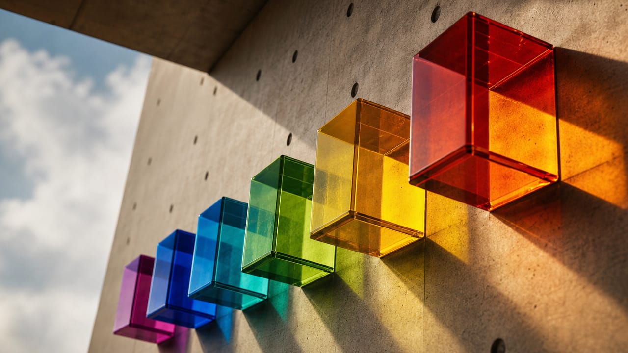
Most exhibition booth design solutions rely on standard frames and default colour schemes, which quickly blend into the background. Our team instead engineers colour palettes for custom stands that integrate graphics, flooring, furnishings, and the visual impact of stand lighting into a single coherent story. By using brand colours in booth layouts with clear intent, we create a recognisable environment that feels distinctly yours, even in a crowded national or regional show.
We begin by mapping your objectives, audience segments, and brand values to specific emotional outcomes, then translate these into colour-led exhibition stand ideas. For example, custom exhibition stands targeting enterprise buyers may pair deep blues with crisp whites, while emotional branding for trade show booths in wellness sectors might focus on soft greens and natural textures. This strategy extends across Exhibition Stand Design, ensuring every visual element supports the same emotional narrative.
Real-world results demonstrate the value of this approach. A technology client used a refined palette and controlled lighting to project reliability, leading to longer conversations and higher-quality leads compared with previous shows. Another client adopted subtle earth tones and calm accent colours, reporting improved visitor comfort and engagement. When you are evaluating exhibition stand ideas or suppliers, choose a partner that can clearly explain how their colour strategy will support your goals. Speak with our team today to explore a colour-driven stand concept tailored to your next Australian event.
Input your search keywords and press Enter.