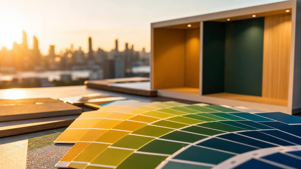



The importance of colour in shell scheme design is often underestimated in Australian exhibition planning, yet it is one of the fastest ways to communicate who you are and why your stand deserves attention. In a crowded hall, considered colour choices influence first impressions, guide behaviour and reinforce your value proposition long after visitors leave your space. Treating colour as a strategic asset rather than surface decoration is now a marker of mature, ROI-focused exhibiting.
In exhibition environments, colour is not about being louder; it is about being clearer, more intentional, and more memorable than the stand next door.
Clarity is the real competitive edge on the show floor, and colour is the fastest route to it. When your walling, flooring and shell scheme graphics align precisely with your brand palette, visitors can place you instantly within their mental map of suppliers. This is especially vital for B2B teams where multiple decision-makers are comparing Shell Scheme Stands after the event. Consistent colour also builds trust, signalling operational discipline and attention to detail.
Colour zoning allows exhibitors to choreograph visitor journeys rather than leaving engagement to chance. Warm, saturated tones can spotlight demo zones, launches or lead capture points, while cooler hues carve out calm spaces for serious conversations. High impact shell scheme walls around hero content help time-poor visitors grasp your narrative in seconds. Smart use of contrast on headlines and calls to action improves legibility and subtly nudges visitors towards the next step you want them to take.
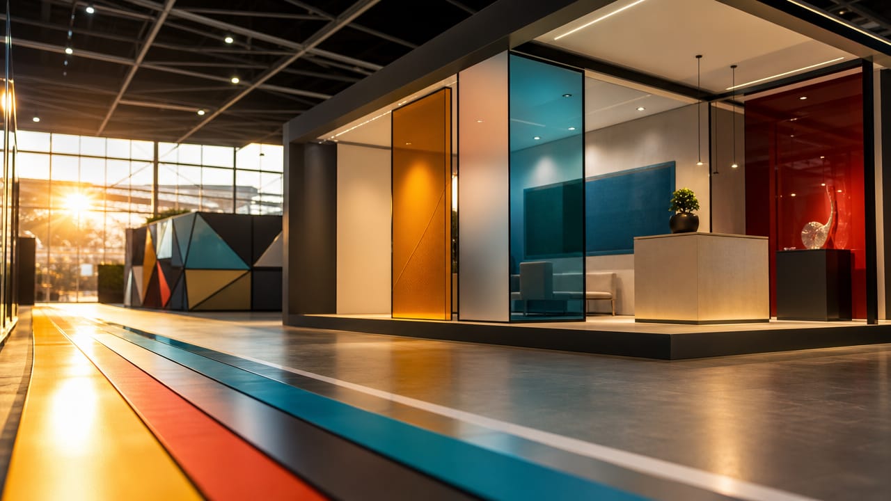
Australian visitors are highly visually literate, accustomed to clean digital interfaces and sophisticated retail environments. They respond well to fresh, natural palettes, with colourful shell scheme ideas that reference coastal blues, muted greens and warm neutrals, while still prioritising legibility. However, venue LED lighting can easily distort subtle tones, turning elegant shades muddy. Testing bright shell scheme backdrops and print proofs under venue-like conditions reduces the risk of on-site surprises and protects your investment.
From a commercial perspective, exhibitors should view shell scheme displays as modular canvases, not limitations. Small booth colour strategies can differentiate a compact footprint just as powerfully as a custom build, provided choices are disciplined. Limit your core palette, then layer cost effective coloured graphics, flooring and furniture to create rhythm rather than visual noise. For teams exploring DIY colourful shell scheme decor, guardrails such as contrast ratios, accessibility standards and print limitations are essential.
Looking ahead, data-informed colour decisions will become standard practice as organisers and exhibitors track dwell time, engagement and lead quality by zone. Teams that embrace using colour in shell booths as a test-and-learn opportunity will outpace competitors relying on habit or personal taste. Your next step is straightforward: audit your recent shell scheme booth projects, identify where colour carried or confused your message, and speak with an exhibition design specialist to refine a sharper, evidence-based colour strategy for your upcoming shows.
Input your search keywords and press Enter.